The latest estimates show that 53% of emails are being opened on a mobile device and this number is steadily rising.
The major players in email marketing (such as Emma and MailChimp) all make it easy to create emails that perform well on mobile devices by offering customizable responsive templates. This means the email will display slightly differently when viewed on a mobile phone:
- Body text sizes usually display slightly larger on a phone than on a desktop
- Columns or rows of images will collapse and stack on top of each other
- The width of the email will drop from 600px to the width of your phone so readers don’t have to zoom in and move around the screen to read your email.
These variables create an infinitely better reading experience for your mobile readers but require a little more effort on your part to ensure your content is delivered as intended. Below are three ways to ensure you’re getting the most out of your email campaign in a mobile environment.
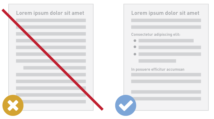
1. Create “skimmable” content
You never know where your readers will be when they open your email—it’d be nice to think they’re at their desk, attentively taking in your every word. Unfortunately in reality, they’re waiting for the train, waiting to pick their kids up from school, or standing in line at Chipotle. The time you have to get your message across is increasingly limited.
So do your readers a favor: try to keep your content relatively short, and use descriptive headlines or subheads to divide the content into more manageable chunks. If you can break up a wordy paragraph into a bulleted or numbered list, do so. This helps to keep your message accessible.
What is the most important piece of information you are trying to communicate? What do you want your readers to take away? Make sure this is the most prominent piece of content—don’t hide it away in a sea of text.
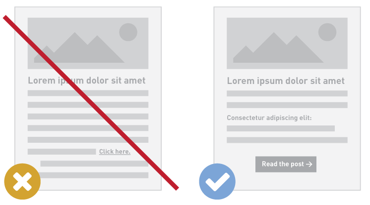
2. Create a clear, clickable call to action
 To make it easy for folks to interact with your content, Apple recommends allowing for ample space for clickable elements in a mobile environment. Ideally, the minimum clickable area should be 44px by 44px.
One of the best ways to achieve this is to create a button—this is good practice regardless of your reader’s device—but especially helpful for mobile readers who are skimming your content to find the next step.
We could write a whole blog post on crafting the perfect call to action, but I’ll keep it brief. Long gone are the days for the ambiguous “click here” button. Your button should tell the reader what the next step is in as few words as possible. Shop now. Read the post. Learn more. Keep it simple, and keep it clear.
3. Test, test, test!
So you’re taking advantage of a new mobile-friendly template—great! Perhaps you even recreated the exact layout you’ve been using for years. That’s totally fine, but make sure you understand how it will display on mobile. Always preview and test before sending, so you know what needs to be adjusted (I hope you’ve been doing this anyway!).
Let’s say you are including an introduction in a narrow column on the right. When this collapses on a mobile phone, the left column will show first, followed by the right column… Meaning your intro will begin halfway through your email, which will be a little puzzling to mobile readers.
An image that was once 600 pixels wide by 150pixels tall is now going to be about half that size. Any text you may have on the image will be harder to read, while the body text of your email has remained legible. Does this now feel unbalanced? Does the image create less of an impact at the smaller size? Perhaps you need to make it a little taller so it carries enough weight.
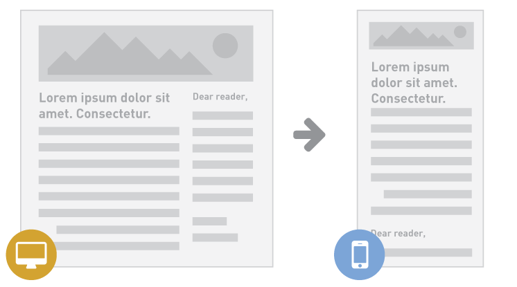 Desktop to mobile
What are some of the adjustments you’ve made to your campaigns to keep them successful in a mobile world?