How do you develop the branding for a local chapter of a national organization with restrictive standards that need to be adhered to? Very carefully.
CASA of DuPage County wanted help developing a stronger application for their visual branding. We had to stay in compliance with the standards set by the national organization while also providing CASA of DuPage County a brand that is friendly yet serious. The challenge was to give the local chapter more flexibility while maintaining a cohesive look with the national brand.
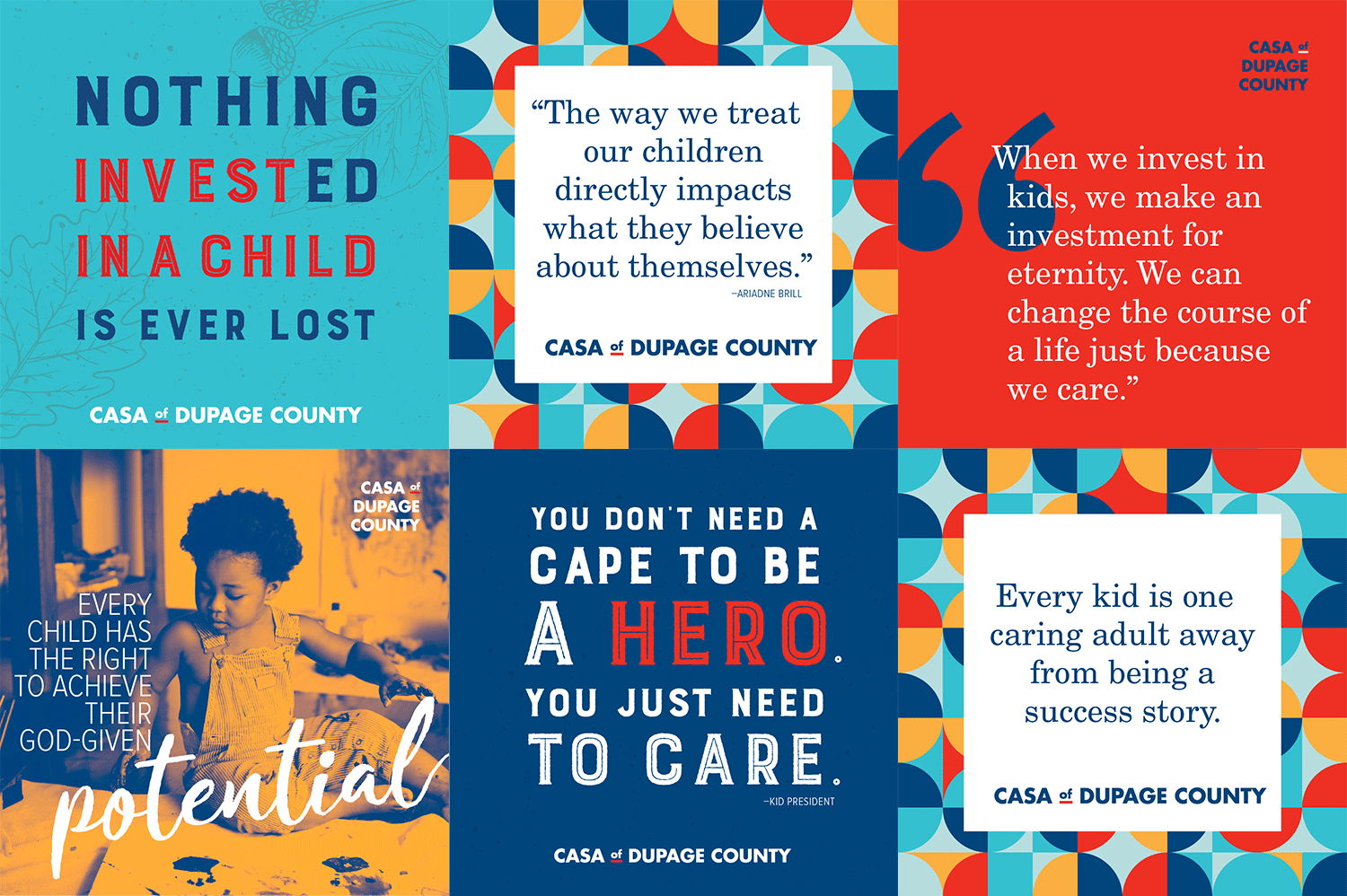
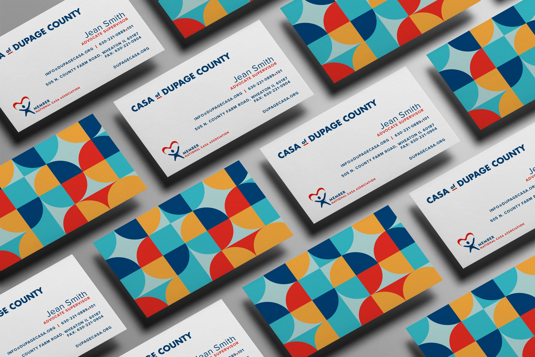
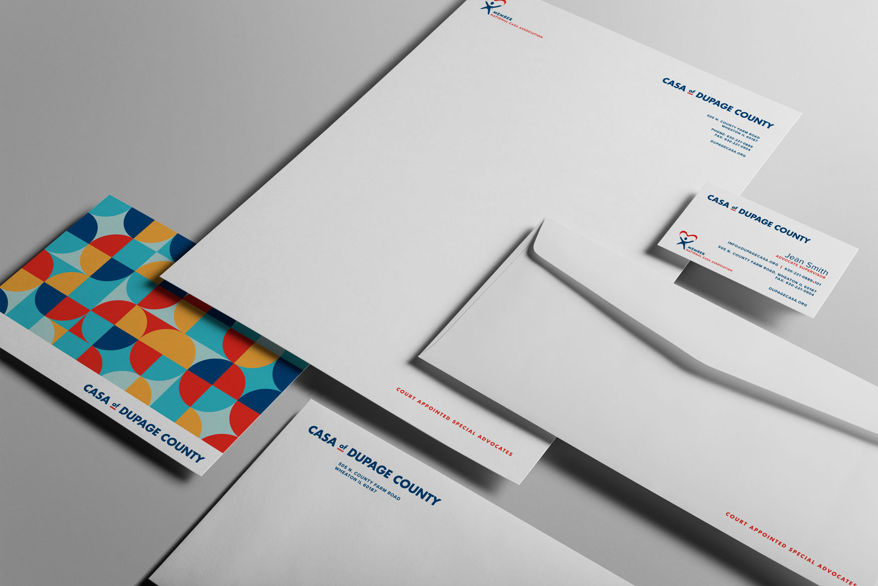
While they were provided with an official chapter logo, in many applications it was hard to read their location. In place of this, we created a typographic lockup (below) for CASA of DuPage County to be used in conjunction with a national logo indicating their membership. This balanced the need to showcase their local presence, while continuing to highlight their membership in the well-known national organization.
![]()
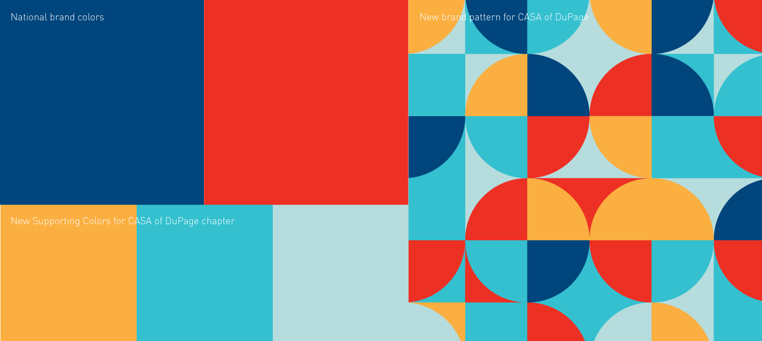
We selected secondary colors to complement the two national brand colors, creating a more friendly image with more variation and flexibility while still maintaining visual cohesion within the national standards.
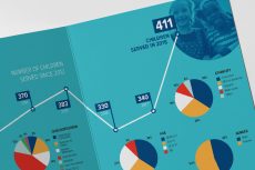
With the new brand elements, CASA of DuPage County has fostered a visually vibrant and optimistic social media presence.